
As founders, we're obsessed with what works. Generic CRO advice is noise. You need battle-tested tactics, not theory. That’s why we’re opening up the BillyBuzz playbook. This isn't another list of vague 'best practices.' These are the exact conversion rate optimization tips we use to turn visitors into customers.
We'll share the nitty-gritty, from the specific subreddits we monitor for copy ideas to the CTA tweaks that doubled our click-throughs. Forget the fluff. This is a founder-to-founder guide for tangible wins, fast. You'll get the filters, response templates, and alert rules we use internally, so you can stop guessing and start converting.
Our focus is on implementation. We’ll cover seven core strategies that drive our growth, breaking down not just the 'what' but the 'how.' For those seeking a high-level framework to complement these hands-on tactics, exploring a variety of Conversion Rate Optimization Strategies can provide a broader perspective on improving site performance.
This guide is built for action. We will explore everything from optimizing landing page speed and personalizing user experiences to leveraging the psychology of urgency and simplifying checkout flows. Each tip is a clear directive you can put to work immediately. Let's dive in.
1. A/B Testing and Multivariate Testing
Guesswork is expensive. The core of our CRO strategy is data-driven decision-making, and that means rigorous A/B and multivariate testing. Instead of debating what we think will work, we test hypotheses and let user behavior give us the answer.
A/B testing is simple: create two versions of an asset (Version A - control, Version B - variation) and show them to different audience segments. Measure which one converts better. Multivariate testing takes this further by testing multiple element combinations at once, revealing how changes interact. It's the most direct way to understand what your users actually want.
How We Implement Testing
At BillyBuzz, every test starts with a clear, falsifiable hypothesis. For example: "Changing our CTA from 'Sign Up' to 'Get Your Free Analysis' will increase clicks by 15% because it highlights immediate value over commitment." This isn't a vague goal; it's a specific, measurable prediction.
Here's our internal checklist for running tests that produce clean data:
- Isolate Variables: In A/B tests, change only one thing at a time (the headline, the button color, the image). This is the only way to know what caused the change in performance.
- Ensure Statistical Significance: We use an A/B test calculator to determine our required sample size before we start. Ending a test early because you're excited about the results is the fastest way to make bad decisions based on noise.
- Run Full Business Cycles: We run tests for at least one full week, sometimes two, to smooth out daily traffic fluctuations. A test that looks great on a Tuesday might tank over the weekend.
- Document Everything: We maintain a simple spreadsheet logging every test: hypothesis, variations, results, and key takeaways. This becomes our internal knowledge base of what works (and what doesn't) for our audience.
Real-World Impact of A/B Testing
Small changes can produce massive lifts. The following infographic highlights some well-documented wins from major brands.
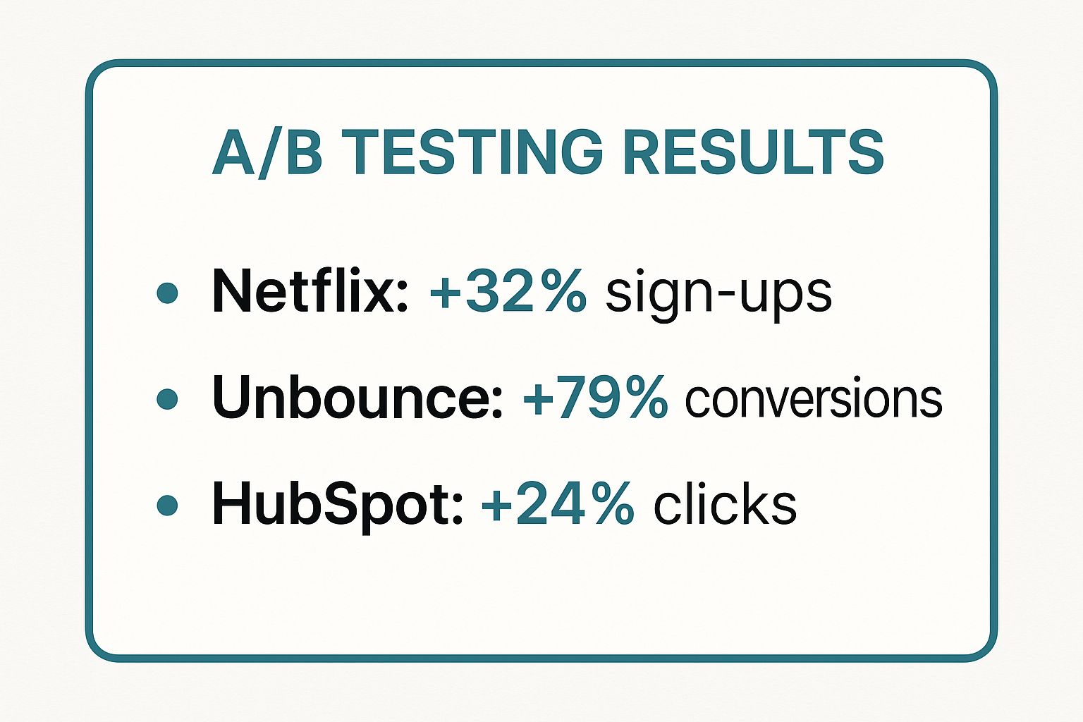
These results prove that even market leaders are constantly testing. By methodically testing headlines, button copy, and imagery, they achieve significant growth in crucial conversion metrics.
For a deeper dive into the methodology and mindset behind successful testing, the video below provides an excellent overview.
2. Compelling and Clear Call-to-Action (CTA) Optimization
Your CTA is the most important button on the page. It's the final step that turns a passive visitor into an active lead. Optimizing it means combining persuasive copy, high-contrast design, and smart placement to eliminate friction and maximize clicks. A CTA isn't just a button; it's the culmination of your value promise.
An effective CTA clearly articulates what the user gets by clicking, making the conversion feel like the logical next step. Whether it’s signing up or making a purchase, a well-crafted CTA provides a clear path forward and can dramatically improve conversion rates.

How We Implement Effective CTAs
At BillyBuzz, every CTA is a mini-value prop. It must be concise, action-oriented, and tied to the user's motivation. We don't ask users to 'Submit'; we tell them what benefit they'll receive, like 'Get My Free Marketing Plan'. To craft truly compelling and clear calls-to-action, digital marketers can explore using AI tools, such as specialized ChatGPT prompts for digital marketers to optimize messaging, to generate and refine their copy for maximum impact.
Our practical steps for high-performing CTAs:
- Use Action-Oriented, First-Person Copy: We swap generic words like 'Submit' for value-driven commands. We've seen significant lifts using first-person copy like "Get My Free E-Book" instead of "Get Your Free E-Book." It creates a sense of ownership.
- Create Visual Contrast: The CTA must stand out. We use a bold, contrasting color that draws the eye but fits our brand palette. We also ensure plenty of white space around it to make it impossible to miss.
- Align with User Intent: The CTA text must perfectly match the promise in the headline. If you promise a free trial, the button must say "Start My Free Trial," not "Sign Up." Any mismatch creates confusion and kills trust.
- Introduce Urgency (Authentically): Phrases like "Claim Your Spot Now" or "Limited Time Offer" work, but only if they are real. We use them for things like early-bird pricing or limited-slot webinars to avoid sounding gimmicky.
Real-World Impact of CTA Optimization
Small CTA changes yield big results. Spotify increased free trial sign-ups by 30% by changing its button from "Learn More" to "Get Spotify Free." This underscores a core CRO principle: clarity trumps persuasion. A clear CTA that tells users exactly what to do and what they'll get in return will always outperform a clever but ambiguous one. This is also crucial for retargeting campaigns. For more insights on this, you can learn more about leveraging AI for smarter user engagement.
3. Landing Page Speed and Mobile Optimization
Speed isn't a feature; it's a prerequisite. A slow site is a broken site. Landing page speed and mobile optimization are about delivering a lightning-fast, seamless experience on any device. Slow loads are the #1 cause of high bounce rates, and a bad mobile experience alienates the majority of your traffic. This is one of the most critical conversion rate optimization tips to master.
The principle is simple: the faster and easier your page is to use, the more likely visitors are to stay and convert. Page speed directly impacts user satisfaction and SEO rankings, as Google's Core Web Vitals prove. With most traffic coming from mobile, a mobile-first design is non-negotiable.
How We Implement Optimization
At BillyBuzz, performance is a core feature. We obsess over load times because we know every millisecond costs us money. The biggest wins come from technical diligence and a user-centric mindset. We regularly audit our site to find and kill bottlenecks.
Here are our practical steps for immediate improvement:
- Aim for Sub-3-Second Loads: We use Google PageSpeed Insights to audit performance. Under three seconds is the baseline standard. Anything slower, and you're losing users.
- Optimize Images: We compress and resize all images without noticeable quality loss. We use modern formats like WebP and implement lazy loading to defer off-screen images. This is often the lowest-hanging fruit.
- Prioritize Above-the-Fold Content: We ensure the most critical content at the top of the page loads first. This is called critical rendering path optimization, and it makes the site feel faster to the user.
- Test on Real Devices: Emulators are fine, but we test on actual iPhones and Androids across different networks (4G, 5G, and even slower 3G) to understand the real user experience.
Real-World Impact of Speed and Mobile Optimization
The link between performance and conversion is direct and measurable. Companies that prioritize speed see immediate revenue growth.
- Pinterest cut perceived wait times by 40%, leading to a 15% increase in sign-ups.
- Mobify's research found that for every 100ms decrease in homepage load speed, there was a 1.11% lift in session-based conversions.
- AutoAnything invested in mobile optimization and saw its mobile conversion rate jump by over 12%.
These figures prove it: a fast, mobile-friendly experience directly drives business growth. By reducing friction and respecting your user's time, you build trust and make it easier for them to convert.
For a deeper look into specific techniques, you can learn more about our mobile page speed optimization best practices on billybuzz.com.
4. Social Proof and Trust Signals Integration
People follow people. Social proof leverages this by showing visitors that others have already used and benefited from your product. This isn't just about adding a few nice quotes; it's a strategic way to reduce uncertainty and build credibility at the exact moment a prospect needs it.
Social proof works because when we're unsure, we look to others for guidance. By showcasing positive reviews, testimonials, usage stats, and security badges, you provide mental shortcuts that signal your brand is trustworthy and your offer is valuable. This is a key element of our conversion rate optimization tips because it directly addresses user anxiety at critical decision points.

How We Implement Effective Social Proof
At BillyBuzz, we don't just sprinkle testimonials randomly. We strategically place them next to conversion-critical elements like sign-up forms and pricing tables. The key is matching the social proof to the potential objection a user has at that moment. A key aspect of building robust trust signals involves actively leveraging customer feedback for business growth to create authentic and powerful testimonials.
Our practical steps for maximum impact:
- Be Specific and Authentic: "Great service!" is useless. A detailed testimonial like, "BillyBuzz's analytics helped us find a 15% revenue leak in our funnel in the first week," builds massive credibility. We actively ask our best customers for these specifics.
- Enhance with Visuals: We always add a real photo, name, and company to testimonials. This humanizes the feedback and makes it more trustworthy.
- Show Recent Activity: We use a small notification widget to show recent sign-ups or positive reviews. A live feed shows that the business is active and consistently delivering value.
- Use Video Testimonials: A short, authentic video of a happy customer is gold. It's harder to fake and conveys an emotional connection that text can't match.
Real-World Impact of Social Proof
The effect of well-placed trust signals can be dramatic. Basecamp famously increased sign-ups by 102.5% by redesigning their landing page to feature a long-form testimonial with a customer's photo. Another example is Vendio, which boosted sales by 12.7% after prominently displaying security badges. These cases prove that building trust has a direct, measurable impact on your bottom line. Integrating these elements is one of the most reliable conversion rate optimization tips you can implement.
5. Simplified and Optimized Checkout Process
The checkout is the final hurdle. It’s where even the smallest friction can cause cart abandonment. A simplified, optimized checkout removes these barriers, creating a seamless and trustworthy path from cart to confirmation. This is where you close the deal.
Checkout optimization is about minimizing cognitive load. This means fewer steps, fewer fields, and making the entire flow feel fast and secure. By stripping away distractions, you respect the user's momentum and guide them to the finish line instead of giving them a reason to leave.
How We Implement an Effective Checkout Flow
At BillyBuzz, our checkout is a high-value asset under constant review. The goal is to make buying so effortless it feels like a natural conclusion. We started by mapping every click and field in our original checkout and asking, "Is this absolutely essential?" If the answer wasn't a hard "yes," we killed it.
Our practical steps to streamline checkout:
- Reduce Form Fields: We scrutinize every field. Do we really need their phone number right now? Expedia famously removed one field and increased profits by millions. We stick to the essentials: name, email, payment info.
- Enable Guest Checkout: Forcing account creation is a massive conversion killer. We offer a prominent guest checkout option. We can always invite them to create an account after the purchase is complete.
- Implement Smart Features: We use address auto-completion (Google Places API) to reduce typing and errors. We enable form field auto-fill and set smart defaults where possible. UX expert Luke Wroblewski found that inline validation (real-time feedback on fields) can reduce completion time by 22%.
- Show Progress and Transparency: We use a visual progress bar (e.g., Step 1 of 3) to manage expectations. All costs, including taxes, are shown upfront to avoid last-minute surprises that lead to abandonment.
Real-World Impact of Checkout Optimization
The power of a streamlined checkout is legendary. Amazon’s patented "1-Click" ordering is the prime example. By saving customer information for instant purchases, they saw a massive lift in conversions, proving the immense value of reducing friction.
Founder-to-Founder Insight: The easier you make it for someone to give you money, the more likely they are to do it. Every extra click, field, or page load in your checkout is a potential exit point.
These principles apply to every business. By focusing on speed, clarity, and convenience, you can dramatically lower your cart abandonment rate. Optimizing this final step is one of the most impactful conversion rate optimization tips you can implement.
6. Personalization and Dynamic Content
One-size-fits-all marketing is dead. Personalization and dynamic content deliver customized experiences based on visitor data like behavior, demographics, or traffic source. This transforms a static webpage into a dynamic conversation that speaks directly to each user's needs, increasing relevance and the likelihood of conversion.
Personalization is about making the user feel seen and understood. Instead of showing everyone the same homepage, you can display different headlines or product recommendations. This is a powerful component of any modern conversion rate optimization tips toolkit, as it moves beyond optimizing a single page for everyone and starts optimizing the experience for each individual.
How We Implement Effective Personalization
You don't need a massive data science team to start. At BillyBuzz, we began with simple segmentation. For example, if a user clicks on an ad about "AI-powered analytics," our landing page headline reflects that exact phrase. The goal is to create a seamless, relevant journey from their very first touchpoint.
Our practical steps for a strong start:
- Start with Traffic Source: This is the easiest win. We personalize landing page content based on the ad campaign or social media post they came from. It shows a unique welcome message that confirms they're in the right place.
- Leverage Browsing History: If a user repeatedly views products in a certain category, we feature those items prominently on their next visit. Simple, but effective.
- Customize Key Touchpoints: We personalize email subject lines with the user's name and reference past purchases. We also use exit-intent popups to present a relevant, customized offer just as a user is about to leave.
- Test Everything: We always test our personalization efforts against a generic control version to prove they are actually improving conversions.
Real-World Impact of Personalization
The impact of personalization is profound. Amazon attributes as much as 35% of its revenue to its recommendation engine. Netflix's algorithm influences an incredible 80% of content watched.
These aren't isolated cases. A study by Evergage found that 88% of marketers saw measurable improvements after implementing personalization. The truth is simple: when you cater to the individual, you build a stronger connection that translates directly into growth. For a deeper look into how AI is revolutionizing this space, you can explore our detailed guide on how AI personalization boosts customer engagement on billybuzz.com.
7. Urgency and Scarcity Psychology
The fear of missing out (FOMO) is a powerful driver of human action. By strategically and ethically using urgency and scarcity, you tap into this principle to encourage immediate conversion. This conversion rate optimization tip involves creating a perception of limited availability—either in time or quantity—which motivates prospects to act now rather than later.
Urgency uses time-based limits (e.g., "offer ends tonight"), while scarcity uses quantity-based constraints (e.g., "only 3 left in stock"). As psychologist Robert Cialdini explained, opportunities seem more valuable when they are limited. When used ethically, these tactics reduce decision paralysis and shorten the sales cycle.
How We Implement Urgency and Scarcity
At BillyBuzz, our rule is simple: be genuine. Manufactured scarcity kills brand trust. We only use it when it's real. For instance, we might offer an exclusive bonus for the first 50 webinar sign-ups—a real, verifiable limit.
Our practical steps for effective implementation:
- Be Truthful and Specific: Don't say "Limited time offer." Say "Sale ends in 2 days, 14 hours." Don't say "Almost gone." Say "Only 5 spots left." Specificity builds credibility.
- Combine with a Clear Value Prop: Urgency alone is not enough. It must be paired with a compelling offer. The user must feel they are missing out on something genuinely valuable.
- Vary Your Tactics: We experiment with different forms of urgency: countdown timers on product pages, limited-stock alerts, or early-bird pricing for events.
- Provide a Clear Path: If an offer expires or an item sells out, we provide a next step, like a waitlist sign-up. This captures the lead instead of creating a dead end.
Real-World Impact of Urgency and Scarcity
The effectiveness of these triggers is well-documented.
- Booking.com famously uses messaging like "Only 2 rooms left on our site!" which creates a sense of immediate demand and scarcity.
- Marcus Taylor, an entrepreneur, boosted email sign-ups by an incredible 332% by adding urgency-driven copy that framed the sign-up as a time-sensitive opportunity.
- Wistia, a video hosting platform, improved its trial sign-ups by 27% by offering a limited-time bonus for new users.
These examples show how well-placed urgency can be one of the most effective conversion rate optimization tips for motivating users to take the final step.
7 Key CRO Tips Comparison
| Items | Implementation Complexity | Resource Requirements | Expected Outcomes | Ideal Use Cases | Key Advantages |
|---|---|---|---|---|---|
| A/B Testing and Multivariate Testing | Moderate to High - setup and traffic needed | Sufficient traffic, statistical tools | Data-driven improvements, measurable ROI | Optimizing headlines, CTAs, layouts | Eliminates guesswork, iterative testing |
| CTA Optimization | Low - relatively simple to implement | Design resources, copywriting | Increased click-through and conversions | Improving button text, color, placement | Quick impact, easy to measure |
| Landing Page Speed & Mobile Optimization | High - technical skills required | Development expertise, ongoing maintenance | Reduced bounce rates, better SEO, conversions | Mobile-first designs, improving load times | Enhances UX, SEO boost |
| Social Proof & Trust Signals | Low to Moderate - content creation and updates | Content management, review collection | Builds trust, reduces purchase anxiety | E-commerce, service trust-building | Inexpensive, psychological impact |
| Simplified Checkout Process | Moderate to High - technical and UX design needed | Development resources, payment integrations | Reduced cart abandonment, higher conversions | E-commerce checkout flows | Streamlines purchase, reduces friction |
| Personalization & Dynamic Content | High - advanced tech and data analytics | Data infrastructure, AI tools | Higher engagement, conversion, retention | Customized experiences, recommendations | Increased relevance and loyalty |
| Urgency & Scarcity Psychology | Low to Moderate - content and timer setup | Copywriting, UI elements | Increased conversions, faster decisions | Limited-time offers, inventory-sensitive sales | Motivates immediate action, boosts sales |
From Insight to Impact: Your Next Move
You've just walked through the core CRO playbook that drives growth at BillyBuzz. This isn't just a collection of tactics; it's a system. The real takeaway is that sustainable growth comes from a relentless cycle of hypothesizing, testing, learning, and iterating.
The most potent conversion rate optimization tips are those that close the gap between your assumptions and your customers' reality. The strategies here—from personalization to trust signals—all answer one question: How can we better serve the person on the other side of the screen? Answering this means moving beyond dashboards and listening to the unfiltered voice of your audience.
Turning Knowledge into Actionable Growth
Information is useless without implementation. Avoid analysis paralysis. Don't try to overhaul your entire website tomorrow. Instead, pinpoint the single biggest point of friction in your user journey right now.
- High mobile bounce rate? Start with page speed.
- High cart abandonment? Simplify your checkout.
- Low CTA clicks? A/B test your button copy.
Pick one area. Launch one measurable test in the next seven days. Document your baseline, form a clear hypothesis ("By adding customer testimonials above the fold, we will increase sign-ups by 10%"), and let the data guide you. This iterative mindset is the secret weapon. It’s how you turn a static webpage into a system that continuously learns and improves.
Integrating the Voice of the Customer
At BillyBuzz, our best hypotheses don't come from brainstorming sessions. They come from raw, unfiltered customer feedback online. We set up alerts in BillyBuzz to monitor specific subreddits like r/SaaS, r/startups, and niche communities for mentions of our competitors or keywords related to problems we solve (e.g., "customer feedback," "user insights").
When we see founders repeatedly asking, "Does anyone know a tool that does X without Y?" that's a direct signal to update our landing page copy. When someone in a thread complains about a competitor's confusing pricing, it validates our simple pricing page. Combining quantitative data from A/B tests with qualitative insights from these real conversations is our unfair advantage. You're not just guessing what works; you're building a business that is deeply attuned to its market. This is the ultimate goal of optimization.
Ready to uncover the exact objections and desires that are holding back your conversions? Stop guessing and start listening with BillyBuzz. Our platform helps you tap into authentic customer conversations on Reddit, giving you the raw insights needed to craft high-impact copy and build landing pages that truly resonate. Discover your next winning A/B test hypothesis with BillyBuzz today.