

As a founder, you're drowning in data. But most of it is vanity. Client engagement metrics are different. They're the numbers that tell you if you've actually built something people care about. They measure actions, not just eyeballs. Getting this right is the difference between a startup that grows and one that fizzles out. This isn't theory; it's how we run our company, BillyBuzz, day-to-day.
Why We Stopped Tracking Vanity Metrics (And You Should Too)
Like most founders, we started out obsessed with the wrong numbers. A traffic spike felt like a win. A surge in signups was a reason to celebrate. We were chasing numbers that looked great in a pitch deck but told us nothing about the health of our business.
We had a classic leaky bucket. Users were signing up, but they weren't sticking around. Our churn was a mystery because we were asking the wrong question. We were asking, "How many people signed up?" instead of, "Are people actually using the core features of our product?"
The Switch from Attraction to Value
The day we switched from vanity metrics to real client engagement metrics was the day we started building a real business. It forced us to see our product through our customers' eyes. A signup is a moment. A user who sets up their first alert and comes back the next day is a story.
A high signup rate with low feature adoption is like a sold-out concert where everyone leaves after the opening act. The initial numbers look impressive, but the main event is failing to connect with the audience.
This mental shift is everything. Vanity metrics tell you how good you are at marketing. Engagement metrics tell you how good you are at solving a problem. Stop getting distracted by empty numbers and focus on the essential content performance metrics that prove you're creating value. If you want to get better at visualizing this, our guide on 10 custom visual templates to simplify data overload can help.
To drive this point home, here’s a simple breakdown.
Vanity Metrics vs. Engagement Metrics
This table shows why focusing on engagement gives you a brutally honest picture of your business.
| Metric Type | Example | What It Really Tells You |
|---|---|---|
| Vanity Metric | Total Signups | How effective your top-of-funnel marketing is. |
| Engagement Metric | Feature Adoption Rate | Whether users are discovering and using the core value of your product. |
| Vanity Metric | Page Views | How many times a page was loaded, without context on user intent. |
| Engagement Metric | Daily Active Users | How many unique users find your product valuable enough for daily use. |
The difference is stark. One set of metrics feels good. The other gives you the hard truths you need to actually improve.
Ultimately, tracking client engagement is about reading the story your users' actions are telling you. These actions are the most reliable predictors of retention, revenue, and the long-term health of your business. They show you who's winning, who's struggling, and exactly where you need to focus your energy to build a product customers can't imagine living without.
The Four Pillars of Client Engagement We Actually Use
When you're swimming in data, it's easy to drown. To keep our heads above water, we needed a simple, actionable framework. So, we boiled all our client engagement metrics down into four distinct pillars. This isn't just some textbook theory; it's the exact dashboard structure we use inside BillyBuzz to make quick, smart decisions.
Each pillar helps us answer a fundamental question about our users, piecing together the complete story of their journey with us.
This diagram shows how we separate the metrics that actually drive the business from the flashy, surface-level vanity numbers.
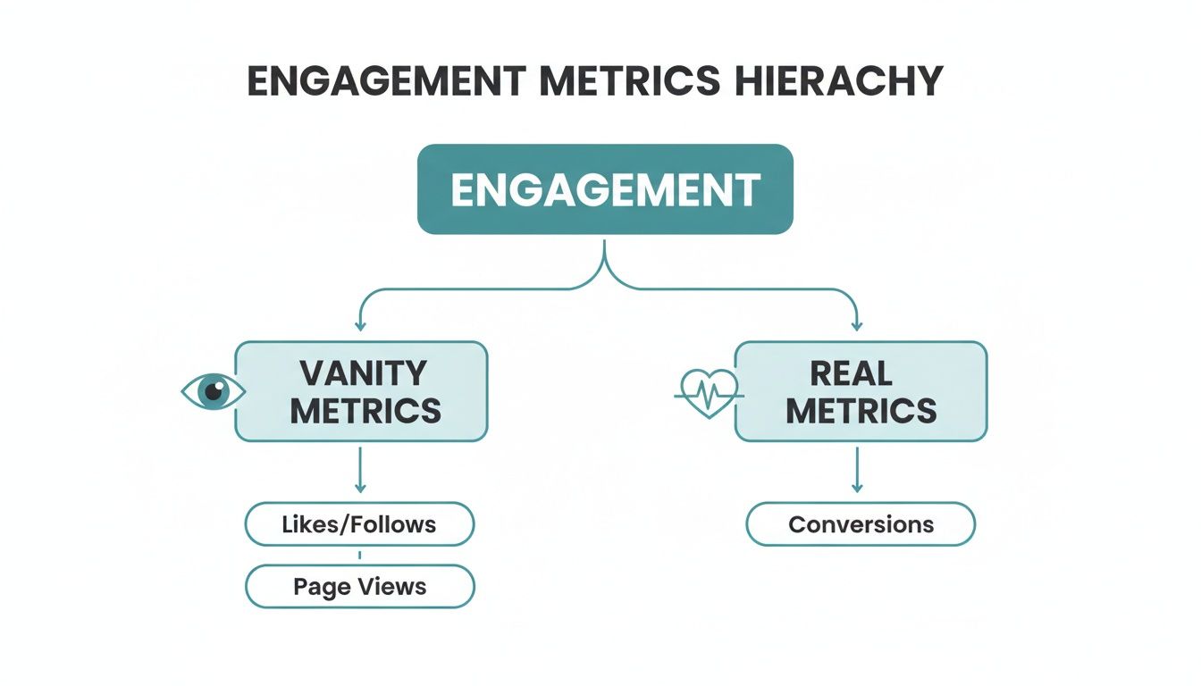
It’s a simple but powerful reminder: vanity metrics might look good on a slide, but real metrics are the true heartbeat of the business, showing us that people are getting real value.
Pillar 1: Behavioral Metrics
Behavioral metrics cut right to the chase, answering the question: "What are our clients doing?" These numbers track the specific actions people take inside our product. They show us which features they love and which ones are collecting dust.
Honestly, these are the most direct signals we have for product-market fit.
At BillyBuzz, the two behavioral metrics we watch like a hawk are:
- Daily Active Users (DAU): This tells us how many unique clients are logging in and using our tool each day. It’s a raw, honest measure of how sticky our product is. A healthy DAU means we’ve built something that’s becoming part of our clients' daily routine.
- Feature Adoption Rate: We calculate this as
(Number of users who used a specific feature / Total number of users) x 100%. It tells us a simple story: are people using the new stuff we build? A low adoption rate is a massive red flag that we either built the wrong thing or, just as likely, we did a poor job explaining why it’s useful.
Pillar 2: Retention Metrics
Retention metrics answer what might be the most important question for any subscription business: "How long do our clients stay?" It costs a fortune to get a new customer in the door; keeping the ones you have is where you actually make money.
These numbers are the ultimate test of long-term value and whether our business is built to last.
The key retention metrics we live and die by are:
- Churn Rate: This is the percentage of clients who hit the cancel button during a specific period. The formula is
(Number of clients who churned / Total clients at the start of the period) x 100%. High churn is like trying to fill a leaky bucket—it can sink a startup, fast. - Customer Lifetime Value (CLV): CLV is our best guess at the total revenue a single client will bring in over their entire time with us. A simple way to look at it is
(Average Revenue Per Account x Customer Lifetime). Our non-negotiable goal is to keep our CLV at least 3x higher than our Customer Acquisition Cost (CAC).
Pillar 3: Satisfaction Metrics
Satisfaction metrics get to the heart of it all by asking: "How do our clients feel?" It’s entirely possible for a client to be active and paying, yet secretly unhappy and ready to jump ship. These metrics give us the "why" behind the numbers.
We’ve learned the hard way that an unhappy, silent client is way more dangerous than an unhappy, vocal one. Satisfaction metrics give that silent majority a voice before they vote with their wallets and leave for good.
Our go-to satisfaction metrics include:
- Net Promoter Score (NPS): We use this to measure loyalty by asking one simple question: "How likely are you to recommend BillyBuzz to a friend or colleague?" on a scale of 0-10. The score instantly separates our biggest fans (Promoters) from our most at-risk users (Detractors).
- Customer Satisfaction (CSAT): After a support ticket is closed, we send a quick, one-question survey to get a CSAT score. This gives us immediate, unfiltered feedback on our customer service quality, a huge driver of overall happiness. To truly build strong relationships, explore these essential client communication best practices that go beyond just sending updates.
Pillar 4: Activation Metrics
Finally, activation metrics answer the crucial question: "How successfully do clients get started?" Those first few moments a new user spends with your product are everything. A clunky, confusing onboarding process is the fastest way to lose someone you just fought hard to win.
Activation is all about getting users to that "aha!" moment—the point where they truly grasp the value you offer—as quickly as humanly possible.
The two numbers we obsess over here are:
- Conversion Rate: This is the percentage of people on a free trial who pull out their credit card and become paying customers.
- Time to First Value (TTFV): This measures how long it takes a new user to complete a key action that proves our product's worth. For us, that’s setting up their very first keyword alert. The faster we get them there, the more likely they are to stick around.
Building Your Engagement Dashboard on a Budget
As a founder, you don't need a pricey data science team or a complicated software stack to start tracking your most important client engagement metrics. We certainly didn't. Here at BillyBuzz, our very first "dashboard" was nothing more than a humble Google Sheet. The real goal is to start lean, get a feel for the data, and build up from there.
The first step is creating a single source of truth. Most early-stage startups have their data scattered all over the place. For us, user activity was in our app database, payment info was in Stripe, and support tickets were in our help desk software. Getting all those different streams to talk to each other is the foundation of any dashboard worth its salt.
We started by manually exporting CSV files from each platform once a week. Yes, it was tedious, but it forced us to get intimately familiar with our own data. I recommend this hands-on approach to every founder; it keeps you from getting lost in abstract numbers and connects you to what your users are actually doing.

From Google Sheets to a Simple BI Tool
Our original Google Sheet had three main tabs for each data source, plus a fourth "Master View" tab that pulled everything together using VLOOKUP functions. This simple trick let us connect a user's activity level with their subscription plan and any recent support tickets they'd filed.
This basic setup was all we needed to build our first essential charts:
- Weekly Active Users: A simple line chart to see if we were growing.
- NPS Trend Line: A bar chart showing the breakdown of Promoters, Passives, and Detractors from our latest survey.
- New Trials vs. Conversions: A dual-axis chart comparing how many new trials we got each week against how many actually converted to paid plans.
It wasn't fancy, but it was incredibly actionable. It gave us a weekly pulse on the business and helped us spot trends before they turned into real problems. For a deeper look at this, you can learn more about building custom dashboards for social media monitoring in our article.
Of course, as our data grew, the manual CSV routine became a huge time sink. That’s when we graduated to a simple, low-cost Business Intelligence (BI) tool. There are tons of options out there, but we picked one that offered direct integrations with our key data sources. This automated the whole data-pulling process and saved us hours every single week.
The Charts We Still Rely On Today
Even with a more powerful tool, we still stick to a few core visualizations that tell the most important stories about our business. We’ve learned the hard way that a crowded dashboard is a useless dashboard. Clarity beats complexity every single time.
A dashboard should answer your most pressing questions at a glance, not create more. If a chart doesn't lead to a clear "what should we do next?" conversation, it doesn't belong on your main dashboard.
Here are the two charts that have guided our strategy more than any others:
Cohort Retention Analysis: Honestly, this is the most powerful chart for any SaaS business. It groups users by the week or month they signed up and then tracks what percentage of them are still active over time. It visually answers the ultimate question: "Are we getting better at keeping our users?" If you see the retention curves for newer cohorts trending higher than older ones, you know your product improvements are actually working.
Feature Adoption by User Segment: This chart breaks down the usage of key features by different customer groups (like free trial users vs. paying customers, or new vs. long-time users). It helps us see if a new feature is resonating with the right audience or if even our power users are ignoring it. That insight feeds directly into our product roadmap and our onboarding flows.
Building your dashboard is a journey, not a destination. Start with what you can manage, focus only on the metrics that drive decisions, and only add complexity when the pain of your current system outweighs the cost of upgrading. An ugly-but-useful spreadsheet is infinitely more valuable than a beautiful BI dashboard that no one ever looks at.
How We Use Reddit to Improve Our Engagement Metrics
While a dashboard gives you a rearview mirror look at your business, the best way to get ahead of your client engagement metrics is to be proactive. Instead of waiting for feedback to trickle in, you need to go where the conversations are already happening.
For us, that place is Reddit. It’s our secret weapon.
Most founders see Reddit as a chaotic, high-risk marketing channel. We see it as the world’s largest focus group, packed with honest, unfiltered conversations about the exact problems our tool solves. We don't go there to sell; we go there to listen and help. This simple shift in mindset has become the single most effective way we influence our engagement metrics—often before a user even signs up.
It’s about moving from a reactive stance to a proactive one. We’re not just answering support tickets; we're joining conversations and solving problems for potential customers out in the open.
Our Internal Reddit Alert System
Inside BillyBuzz, we’ve rigged up a simple but powerful listening engine. We use our own tool to create keyword alerts for terms tied directly to our business, like 'customer feedback tool' or 'social listening for startups'. We also keep a close watch on mentions of our direct competitors.
We focus our efforts on specific, high-value subreddits where our ideal customers hang out. Here are our top three:
r/SaaS: This is ground zero for SaaS founders and operators talking about tools, strategies, and pain points.r/startups: A broader community where early-stage founders are actively looking for advice on growth and customer acquisition.r/Entrepreneur: A hub for business owners hunting for solutions to common challenges, many of which relate to customer feedback.
When our tool flags a relevant conversation based on context and sentiment—not just a lazy keyword match—it sends an instant alert to a dedicated Slack channel. This means we can jump into a conversation within minutes, not days.
Here’s what our actual Slack alerts look like, showing a new mention BillyBuzz flagged in the r/SaaS subreddit.
Getting this notification in real-time is a game-changer. It lets us engage while the conversation is still hot, dramatically increasing our chances of making a real connection.
The Non-Salesy Response Template
The golden rule of Reddit is simple: don't sell, help. Break that rule, and the community will downvote you into oblivion. Our entire strategy is built on providing genuine value without ever pushing our product.
Here’s the exact template we use as a starting point for our responses. It’s designed to feel authentic, helpful, and completely non-promotional.
Hey [Username], saw you were asking about [the specific problem]. I've run into that same challenge myself while building [a brief, non-salesy mention of our context, e.g., 'our own feedback tool'].
Here are a couple of things that worked for us that might help you too:
- [Actionable Tip 1]: A specific, detailed piece of advice that directly addresses their question.
- [Actionable Tip 2]: Another concrete suggestion, maybe pointing to a free resource or a different way of thinking about the problem.
Not here to sell anything, just wanted to share what I've learned. Hope it helps you find a solution that works for you!
This approach works because it positions us as a helpful peer, not a vendor. By offering solutions freely, we build trust and authority. Naturally, people get curious, check out our profile, and find their own way to BillyBuzz. If you want to learn more, we have a complete guide on how to set up Slack alerts for Reddit mentions in 10 minutes.
Connecting Reddit Activity to Real Business Metrics
This might sound like a lot of effort just for brand awareness, but we can draw a direct line from these Reddit interactions to our core client engagement metrics. A single helpful comment can create a massive ripple effect.
First, it directly impacts our acquisition metrics. We often see users sign up and mention in our onboarding survey that they "saw us on Reddit." These folks tend to have a much higher activation rate because they’re already warmed up to our brand and get what we do.
Second, it boosts satisfaction and retention. By publicly showing our expertise and willingness to help, we build loyalty before someone even becomes a customer. This proactive support sets a positive tone for their entire journey with us, which often translates to a higher NPS score down the line. It also cuts down on future churn, since these users feel a stronger connection from day one.
Ultimately, this strategy significantly increases Customer Lifetime Value (CLV). In fact, for small teams and founders, CLV emerges as the crown jewel of client engagement metrics. A tool like BillyBuzz, with relevancy scoring that goes beyond simple keywords, can uncover hidden opportunities in subreddits like r/entrepreneur. A single timely reply there can elevate CLV by 3-5x by generating valuable, SEO-boosting threads. You can discover more insights about these engagement metrics and how they are measured.
Setting Realistic Engagement KPIs for Your Startup
So, what does "good" engagement actually look like when you're just getting started? It's a question I hear from founders all the time, and the honest answer is always the same: it completely depends on your stage. Pitting your early-stage numbers against a public company's is just a fast track to feeling discouraged.
A much smarter way to think about it is to set Key Performance Indicators (KPIs) that map directly to your most pressing business goals. For a startup, this means your client engagement metrics can't be set in stone; they have to grow up right alongside your company. This approach turns what could be a jumble of abstract data into a powerful story of progress for your team and any investors watching.
Pre-Product-Market Fit: It's All About Activation and Adoption
Before you've hit product-market fit, your entire world should revolve around one question: "Are we building something people truly want?" At this point, agonizing over retention rates or Customer Lifetime Value is a total waste of energy. Your one and only mission is to prove your core idea has legs.
This means your KPIs need to be surgically focused on the very first steps of the user journey.
- Activation Rate: Out of everyone who signs up, what percentage actually completes the critical setup steps? This is your number one clue as to whether your onboarding is clear and people are finding that "aha!" moment.
- Feature Adoption Rate: Are new users even trying the one or two key features that deliver your core value? If this number is low, it’s a massive red flag. You've either built the wrong thing, or you're doing a terrible job explaining it.
Back when we were pre-PMF at BillyBuzz, our goal was painfully simple: get 50% of new trial users to set up their first keyword alert within 24 hours. That was it. We tuned out almost everything else because if we couldn't hit that number, we knew nothing else would matter down the line.
Post-Product-Market Fit: Shifting to Retention and Satisfaction
Once you nail product-market fit, the whole game changes. You've proven people want what you're selling. Now, the real challenge is keeping them around and building a business that can last. Your focus naturally pivots from just getting users in the door to keeping them happy for the long haul.
This is when your engagement KPIs should start reflecting long-term value and customer health.
- Monthly Churn Rate: What percentage of your customers are you losing every month? For any subscription business, this quickly becomes the most vital sign of your company's health.
- Net Promoter Score (NPS): Beyond the numbers, how do your customers feel about you? This is the qualitative insight that gives you the "why" behind your churn and retention figures.
As a founder, you have to get comfortable with the idea that your KPIs are temporary. The metrics that define success in your first year will be little more than footnotes in your third. The real skill is aligning your team's focus with whatever the company's most immediate, make-or-break challenge is at that moment.
Sample Quarterly KPIs by Startup Stage
To make this less abstract, here’s a look at how your engagement KPIs might evolve. Think of these as realistic, founder-to-founder examples, not some impossible-to-reach industry benchmark.
| Startup Stage | Team Size | Primary Business Goal | Sample Quarterly Engagement KPI |
|---|---|---|---|
| Pre-Seed | 1-5 people | Validate core product value | Achieve a 40% activation rate on the primary feature. |
| Seed Stage | 6-15 people | Reduce early customer churn | Decrease monthly revenue churn from 8% to 5%. |
| Series A | 16-50 people | Increase expansion revenue | Increase average NPS from +20 to +35 to identify promoters for upsell. |
When you tie your client engagement metrics directly to your company's stage and strategic goals—whether that's locking in your next funding round or hitting profitability—you do something amazing. You transform numbers on a dashboard into a compelling narrative. It’s the story that gets your team aligned, clarifies your priorities, and shows investors you know exactly what it's going to take to win.
Our Founder-To-Founder Action Plan and Reporting Template
Alright, let's turn all this theory into something you can actually use. Knowing what to track is one thing, but consistently acting on it is what separates the startups that win from those that don't. The goal here isn't to build a massive, complicated dashboard overnight. It's about creating a simple, sustainable weekly habit that keeps you tuned in to what your customers are really telling you.
Don't underestimate this discipline. It pays off, big time. Companies that obsess over their customers and nail client engagement metrics like NPS see 41% faster revenue growth and 51% stronger customer retention than their peers. That's not just a small bump; it’s a game-changing advantage. You can read the full research about these powerful customer experience findings for yourself.

The 30-Minute Weekly Engagement Sync
Here at BillyBuzz, we have a standing 30-minute engagement review every single Monday. It's a non-negotiable part of our week. To keep it quick and to the point, we rely on a dead-simple template that anyone on the team can fill out. This structure is our secret weapon—it stops us from getting lost in endless data and forces us to jump from insight to action.
This is the exact template we use. Feel free to copy and paste it into a shared doc or a Slack channel to start building your own reporting rhythm.
BillyBuzz Weekly Engagement Report
Week of: [Date]
Completed By: [Your Name]
1. The Numbers (10 minutes)
- DAU/MAU Ratio: [Current %] (Last Week: [Last Week's %]) - Are users sticking around?
- Monthly Churn Rate: [Current %] (Last Week: [Last Week's %]) - Are we keeping the customers we win?
- Net Promoter Score (NPS): [Current Score] (Last Survey: [Last Score]) - How do our customers feel?
2. The Story (10 minutes)
- One Key Insight from a Customer Conversation:
- "I spoke with Jane from Acme Corp, and she said she loves our new alert feature but wishes she could customize the notification sound."
- One Surprising Thing We Saw in the Data:
- "Our feature adoption rate for the new analytics dashboard is only at 5%, much lower than we expected."
3. The Plan (10 minutes)
- What is the #1 engagement problem we need to solve this week?
- Low adoption of the analytics dashboard.
- What is one specific action we will take to fix it?
- Email all users who haven't tried the dashboard with a short, 30-second GIF showing them exactly how to use it.
This simple framework translates abstract client engagement metrics into a clear, weekly battle plan. It connects the hard data with real human stories, making sure you never forget the people behind the numbers.
Your Top Questions About Engagement Metrics, Answered
As founders ourselves, we've heard these same questions about client engagement metrics pop up time and again. It's easy to get lost in the weeds, so we've put together some straight-to-the-point answers based on what we've learned in the trenches building BillyBuzz.
What Is a Good Engagement Rate?
This is the classic question, but the honest answer is: it depends. What's "good" is completely relative to your industry, your business model, and especially the stage of your startup.
Instead of getting hung up on benchmarks from huge, established companies, focus on your own trajectory. A much better question to ask is, "Is our engagement rate getting better over time?" Seeing a steady, month-over-month increase in a key ratio like DAU/MAU is a far more powerful signal for an early-stage company than hitting some random industry number.
How Often Should We Be Tracking These Metrics?
It’s tempting to refresh your dashboard every five minutes—we’ve all been there. But that's a classic founder trap that leads to knee-jerk reactions based on noise, not meaningful signals. You'll save your sanity and make better decisions by getting into a consistent rhythm.
Here’s the cadence that works for us:
- Daily Check-in: A quick look at Daily Active Users (DAU) is all you need. Think of it as making sure the lights are on and the core system is healthy.
- Weekly Review: Set aside 30 minutes to review your core KPIs. For us, that’s churn, NPS, and our activation rate. We use the reporting template we shared earlier to keep it focused.
- Monthly Deep Dive: This is where you zoom out. We look at cohort analysis to see if the product changes we made last month are actually making new users stick around longer than the previous cohort.
Don’t just track metrics; build a rhythm around reviewing them. A consistent weekly sync is more valuable than a complex dashboard you never look at. This discipline turns data into decisions and keeps your team focused on what really moves the needle.
For an Early-Stage Founder, Which Metric Matters Most?
If I had to stake my company on just one metric in the early days, it would be the Activation Rate. Hands down.
Before you can worry about long-term retention or satisfaction, you have to prove that new users can actually find value in your product. The activation rate tells you if people are experiencing that "aha!" moment. A low number here is a massive red flag, pointing to a serious problem in your onboarding flow or even your core value proposition itself.
Get this right first. Nailing activation gives you a solid foundation to build everything else on.
Ready to stop guessing what your future customers are saying? BillyBuzz uses AI to find relevant conversations on Reddit and sends them right to your Slack. Start monitoring and engaging today.